


Abandoned Truck
I have been revisiting shots I took in New Mexico from a few years back.


This old truck has been sitting and slowing rusting for years. I drove by it many times—it’s on the road between where I used to live and where I worked. It’s sitting under trees; it’s a bit of a hike to get to; it never seemed to be in the right light. So one day I just stopped, took some photos, and hoped for the best.
I was never able to get a result I liked with it, however. So it sat for almost 4 years, unprocessed.
Yesterday, I wanted to take a look at photos I had taken with a lens I no longer have, the Sony 180mm f/1.8. I remember it as a sharp lens; sharp lenses usually take shots I’m happy with, if I can just aim them properly!
So I started to work on this one. After a few frustrating hours of trying one thing and another, I had a hot mess:
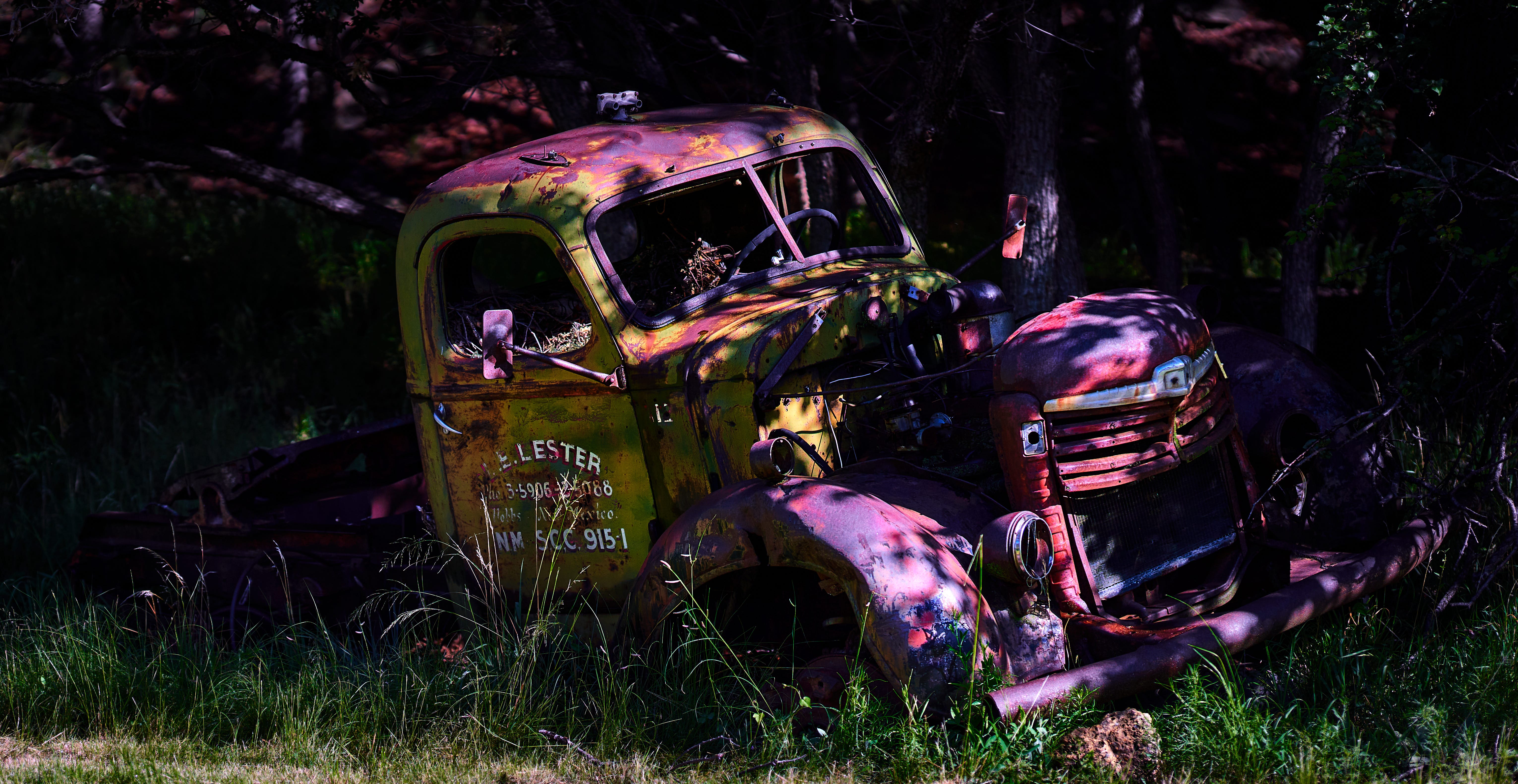
In its favor, the image has impact, but the colors are weird. Weird can be good: purple rust and green pain might make a decent album cover for a punk band. I think it is a good graphic, in other words, but it doesn’t convey what I feel about the truck and the location.
So the next day, I went to work again. I wanted to find the right color for the rust—which made the truck a garish green. And I wanted to find the right shades for the truck—which gave me purple rust. What do do?
I process my images in Capture One, which allows a really gradual approach to image processing. I don’t often use that approach; it can lead to crazy colors and tones. But since the original picture was very dark, it was hard to add light and not get really intense colors. I went back to the original image, and sure enough: it has really intense, almost unnatural-looking colors:
The rust looks more or less brown, but sure enough, if you brighten it, you can see the weird purple tones. Which means, crazily enough, that my attempt to keep the natural colors was my problem: the actual colors look kinda crazy as you add more light to the shot!
So late last night, I rolled up my sleeves and did what any good painter would do: I made my own colors, by shifting both the entire shot and specific problem areas. That was how I got to the result at the top.
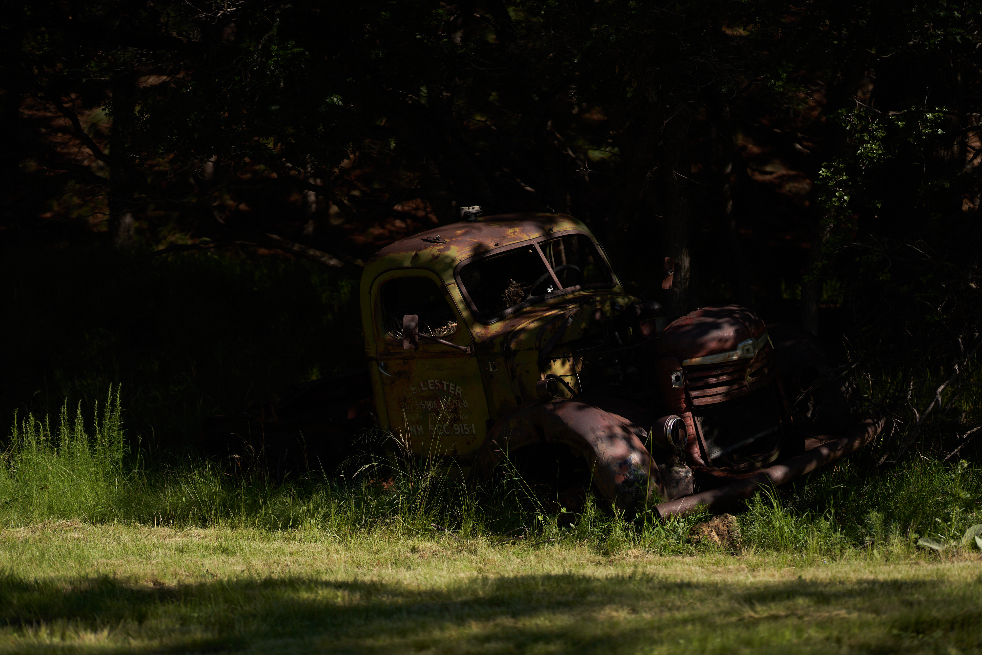
As I am writing this, I am also thinking: wait a minute. How careful was I when adding light to the image to preserve the colors that were there? Did I take the wrong direction at some point, or is it really the case that the rust in this case really is a weird, local color? After all; it does look sort of brown int he original image, and the dark truck actually has a kind of grace to it—even though it’s very dark, it has good form and composition. And it is in the shadows!
So here is the dark image only lightened (by about 2 stops), no other changes:

It’s actually fairly similar to my final result at the top of this page. So what I had done was somehow introduce a color shift, and then meticulously walk the image from that back to a more painterly version of the original image. Wow. Talk about doing things the hard way.
I do like the painterly contrast and slightly enhanced colors of my final version, but even the original has charm. Sometimes we just ry too hard…and yet it is still worth the journey. I was literally able to add light to a shadowed subject and, at least to my own eyes, bring it not just to life, but to a feeling that reminds me of my years in New Mexico.
I love this. Lots of character. I love the way the sun and shadows emphasize the curvy nature of the truck. Nice!!!