


Black and White Tricks
Using light and dark to emphasize texture

Contrast is an interesting word when it comes to photographs. Generally speaking:
Increasing contrast pushes more pixels into the extremes: dark pixels get darker; light pixels get lighter.
Decreasing contrast pushes more pixels to the middle: dark pixels get lighter, light pixels get darker.
Image processing programs give you various ways to do this pushing around. A common method is called Curves in Photoshop. Here is what the image above looked like before I started to work on it:
This image has two issues: shadows are completely black, and details that should be bright are a medium gray at best. It needs an overall brightening, and an increase in contrast as well.
This is what the Curves tool in Photoshop looks like before I made any changes:

To reduce contrast, I would brighten the darks, and darken the bright areas:

This is what my final image, at the top of this post, would look like with less contrast. The dark areas are no longer black, the bright areas are no longer white.
A simple curve that increases contrast, by making the darks darker, and the highlights lighter:
This is what the image looks like with increased contrast:

My first image was the result of both overall contrast changes, and contrast changes in small brightness ranges. To increase the contrast of a small brightness range, you leave most of the curve straight, and only make the change in one area, like this:
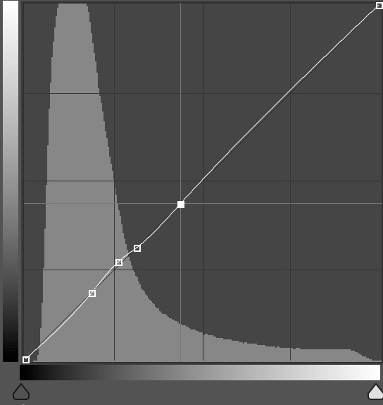
You can even adjust more than one area at a time once you get the hang of it. This was particularly helpful in bringing out the details in the rock at bottom center, which I wanted to be the focus of the image. But it also did a good job balancing the brightness and details of the log.