

Converting a Color Photo to B&W
It's a much more interesting exercise than you would expect.

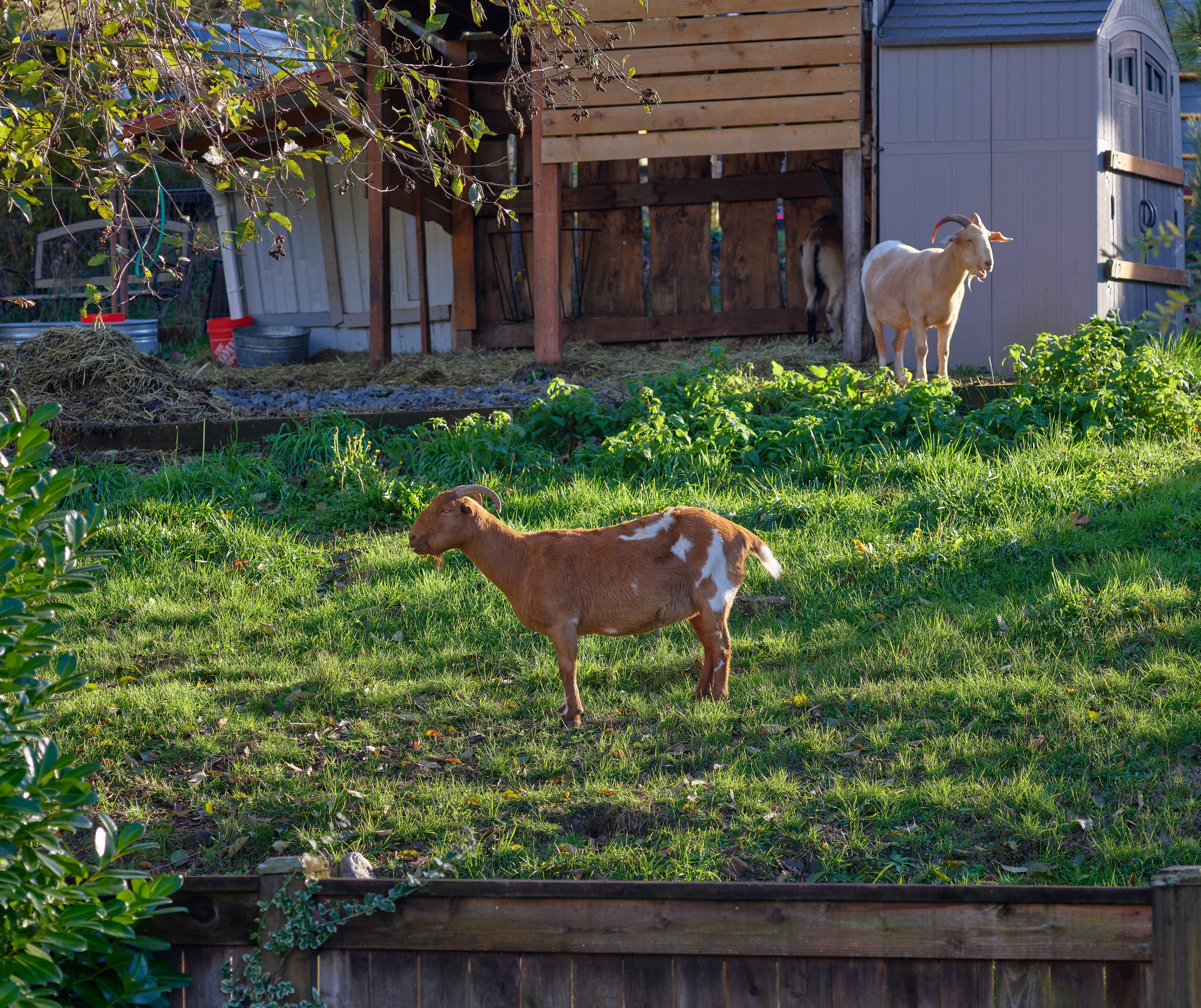
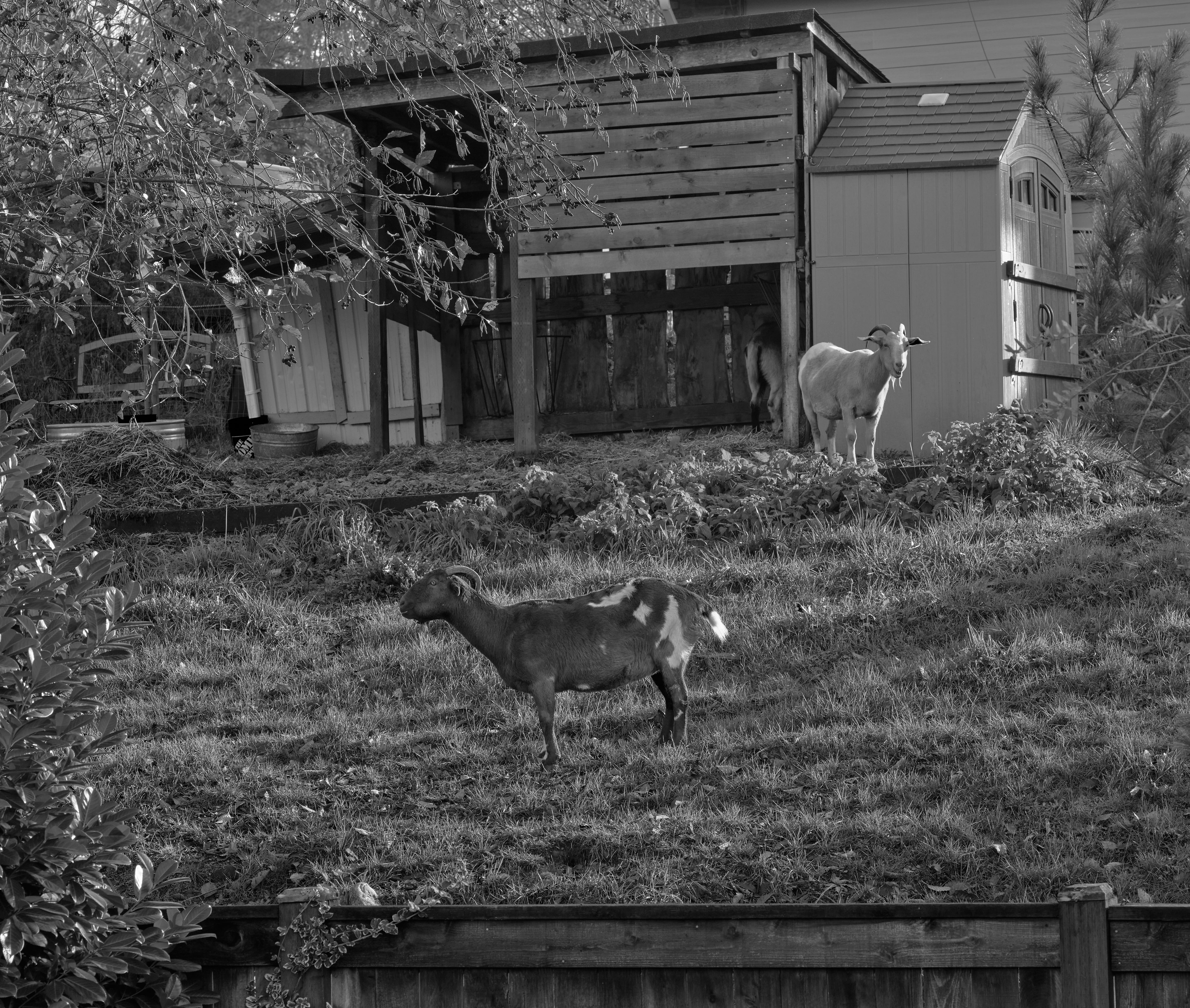
Here is a color photo of some goats. It was not a photo that I was even trying to do ‘pretty’. I have been testing lenses and camera for a few weeks, and this was just a test shot with a particular camera and lens combination.
[Schneider Kruzneach Componon-S 150mm f/5.6 at f/11, ISO 200, 1/100th]
[Phase One IQ4 150 camera]
Someone on Facebook asked a question: how do I convert a color photograph to black and white, and have it look good. (He was particularly interested in the admittedly brilliant B&W work of Stephen DiRado; you can see his work here.)
I have previously tried to convert my color work to B&W with varying levels of success; it’s’ mostly hit or miss. It works, or it doesn’t work. Looking at DiRado’s beautiful photos, it seemed to me that his control of contrast was a very important factor in how good his photo’s look. I’m not saying I’ve divined his secrets; I’m saying I admire his use of contrast to organize and arrange his photos. He has an uncanny ability to make a single person stand out in a group shot, for example. I have no idea how he does this; I am just asking myself the simple question: could I achieve something like that when converting my color photos to black and white?
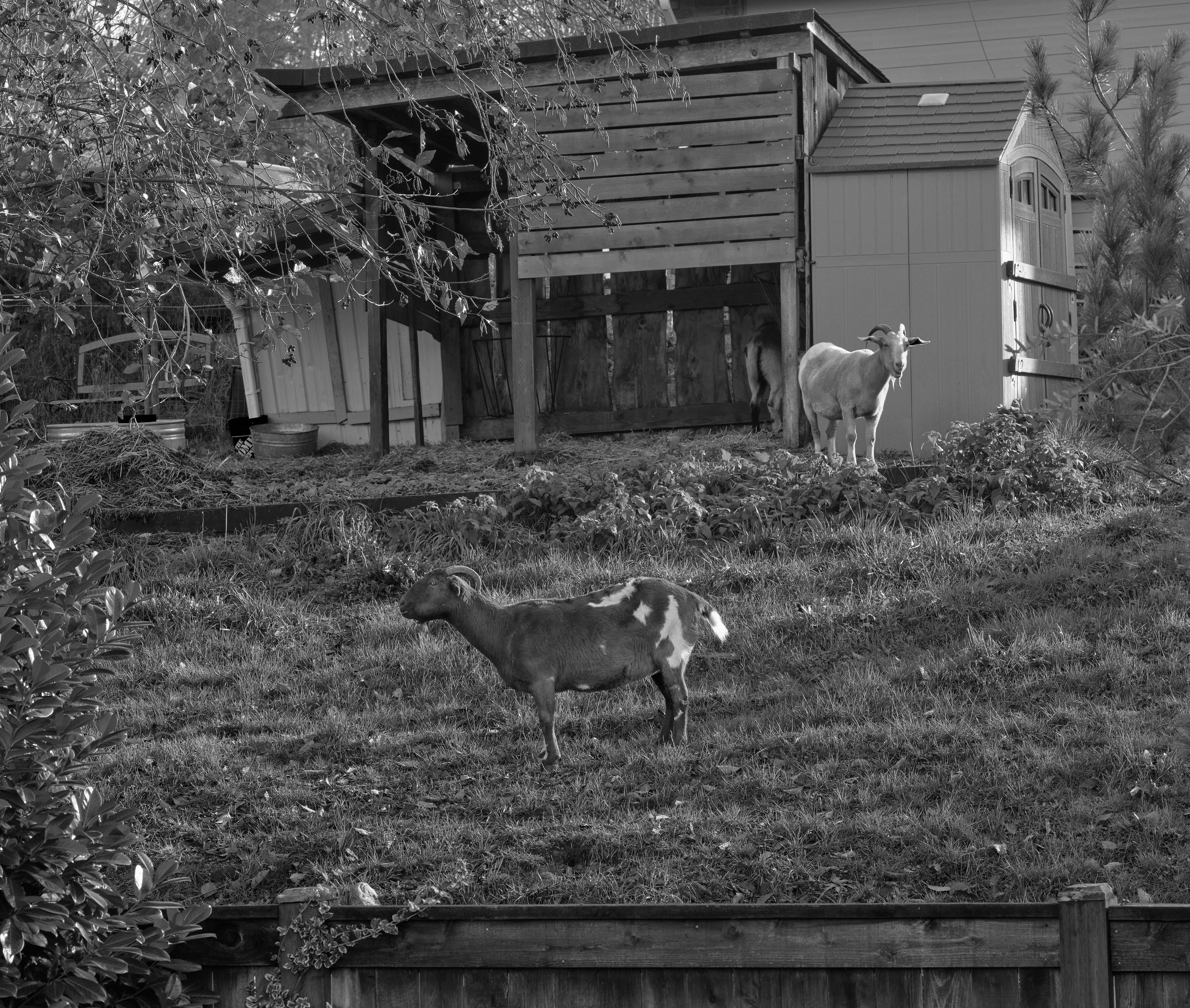
Here is the image above converted to black and white with no special settings:
It’s not a terrible photograph. But it does not achieve my goals state above. It’s crowded, and elements of the photo compete for attention.
My first conception of how to change that was as follows (and I apologize in advance if I am unable to describe it adequately—it was a sudden insight where a whole lot of things fell into place, not a single step):
To use the Color Sensitivity sliders in Capture One (my editing software) to adjust the contrast between and among elements of the photograph to emphasize what I felt was important in the photo, and to also give the photo a kind of shape with emphasis here and de-emphasis there.
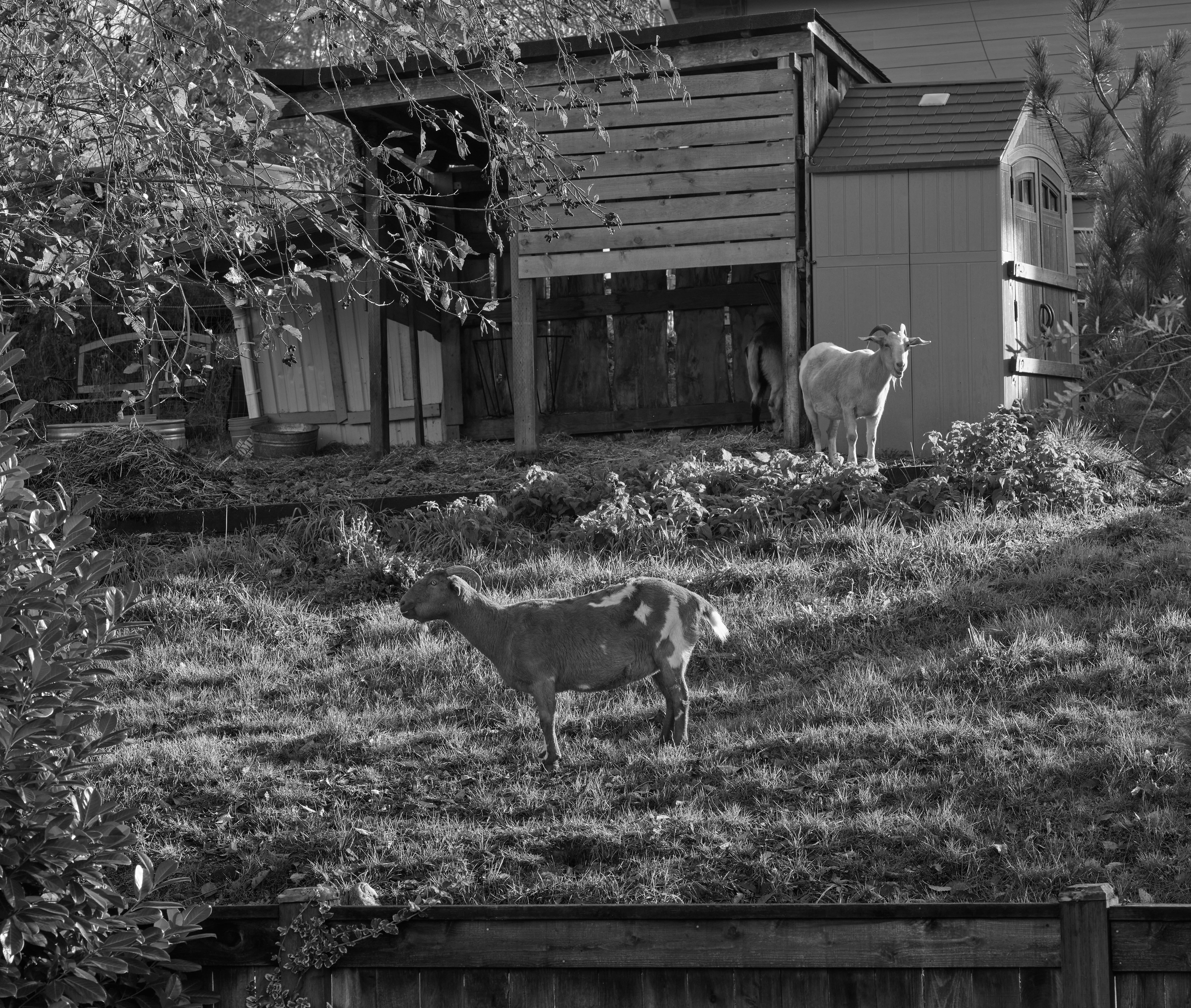
As I sometimes do, I had a violently strong feel for what I wanted to do, so I grabbed the first acceptable photograph I found (above) and proceeded to adjust the slides for B&W color sensitivity with two goals in mind: the lower goat was to be the strongest element of the photograph, and the rest of the photo was to be de-emphasized with less overall contrast. Sharpness of the photo was to remain unchanged. Only contrast created with the color sliders would be used to create ‘psychological contrast’ to make an at least ‘nice’ B&W photo.
Here are the settings I used. A slider moved to the left reduces the brightness of that color; a slider move to the right increases brightness. Dark, left; bright, right.
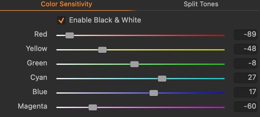
How did I decide on these settings? I adjusted red first, because the lower goat is tan (also known as orange, which is made of red and yellow). So I had to lower yellow as well. The grass has a lot of contrast; also lowering green brings down the grass brightens overall.
I also lowered contrast overall. I lowered it dramatically, because I was sensing I could control apparent contrast with these color adjustments alone, at least for this shot. I lowered it by -46, which is nearly the full range I could use (which is -50).
I also adjusted some general settings. I made shadows brighter (also reduces overall contrast) and deep shadows darker (which brings back some contrast, but only in already dark areas). And I increased saturation, which effectively increased the range of possibilities with the color sensitivity settings.
Cyan (light blue) was increased because it brightened shadows (another thing that brought down the contrast). (Shadows are blue, because they are lit by blue sky, not sunlight.) A little brightening of blue did some of the same, but there were also blue surfaces in the background illuminated by the sun, and making blue a little brighter made them lighter, also reducing overall contrast.
Darkening magenta made some of the deeper shadows even deeper, supporting what I was doing my darkening the deepest shadows in other settings.
This was the result.
It’s a different photograph; I don’t know if it’s a better one, that’s too complicated a question. ;)
What changed? The contrast of the shot is lower; I was able to make that happen by adjusting color sensitivity instead of only lowering contrast. (I adjusted contrast down to get the general level I wanted, and then I used color sensitivity to bring attention to some details and to make other details recede into the now lower contrast background.)
I did I think manage to make it a photograph of two goats, instead of a photograph of a back yard with goats in it. The forms of both goats is high contrast, but the overall image is not. Sunlight is muted, even soft and satiny, an effect I like sometimes and I like it here.
There’s a long learning curve from this first attempt to being able to use this reliably and with intention, but it’s a good start, I learned a lot. A few things even worked!
A second attempt. I saw some things in the first version that I wanted to experiment with. The relationship of the lower goat to the grass is significantly different. Well at least to my eye. ;)