


Correcting Wide Angle Distortions
An extreme method for an extreme distortion


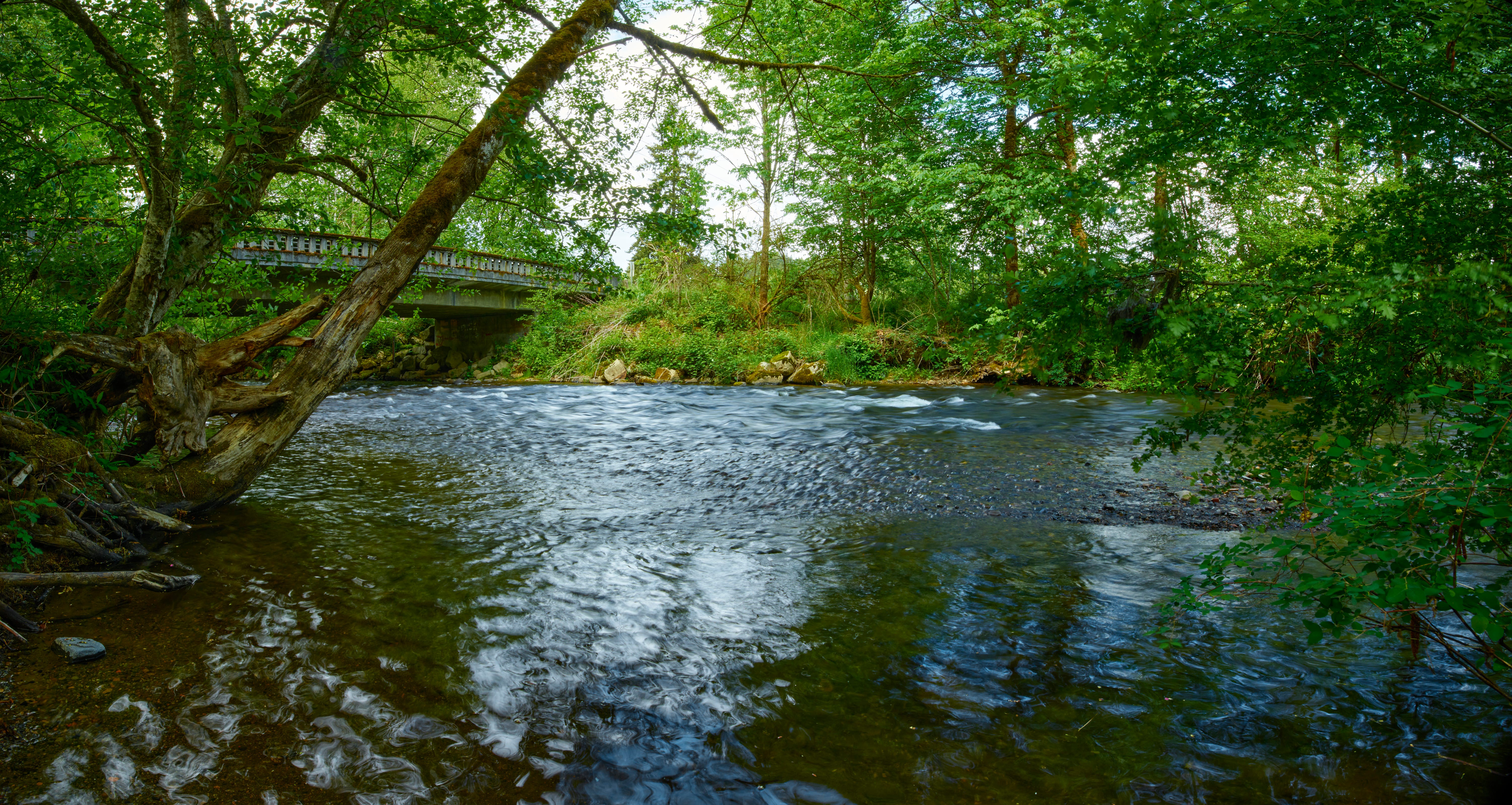
The image above is a three-image panorama of a portion of Prairie Creek near Route 162 in South Prairie, WA. This is a time exposure, which is where the smoothed-out rapids come from, as well as the bizarre swirly reflections at lower left (which are colored white by cloud reflections and blue by sky reflections).
One obvious thing about it is the black corners. Those corners are the purpose of this post: why are they there? How did they get there???
Let’s start at the beginning. I took three images down by the water with the 17mm Canon TS-E (tilt/shift) lens. I rented it to see what it is like with my medium format camera, the Cambo WRS-5000.
The first thing I noticed right away was that the corners were badly distorted. They are stretch along a line from the center to the corner. The center is sharp and well-defined; the corners are mush. Here is the upper right corner before any corrections:
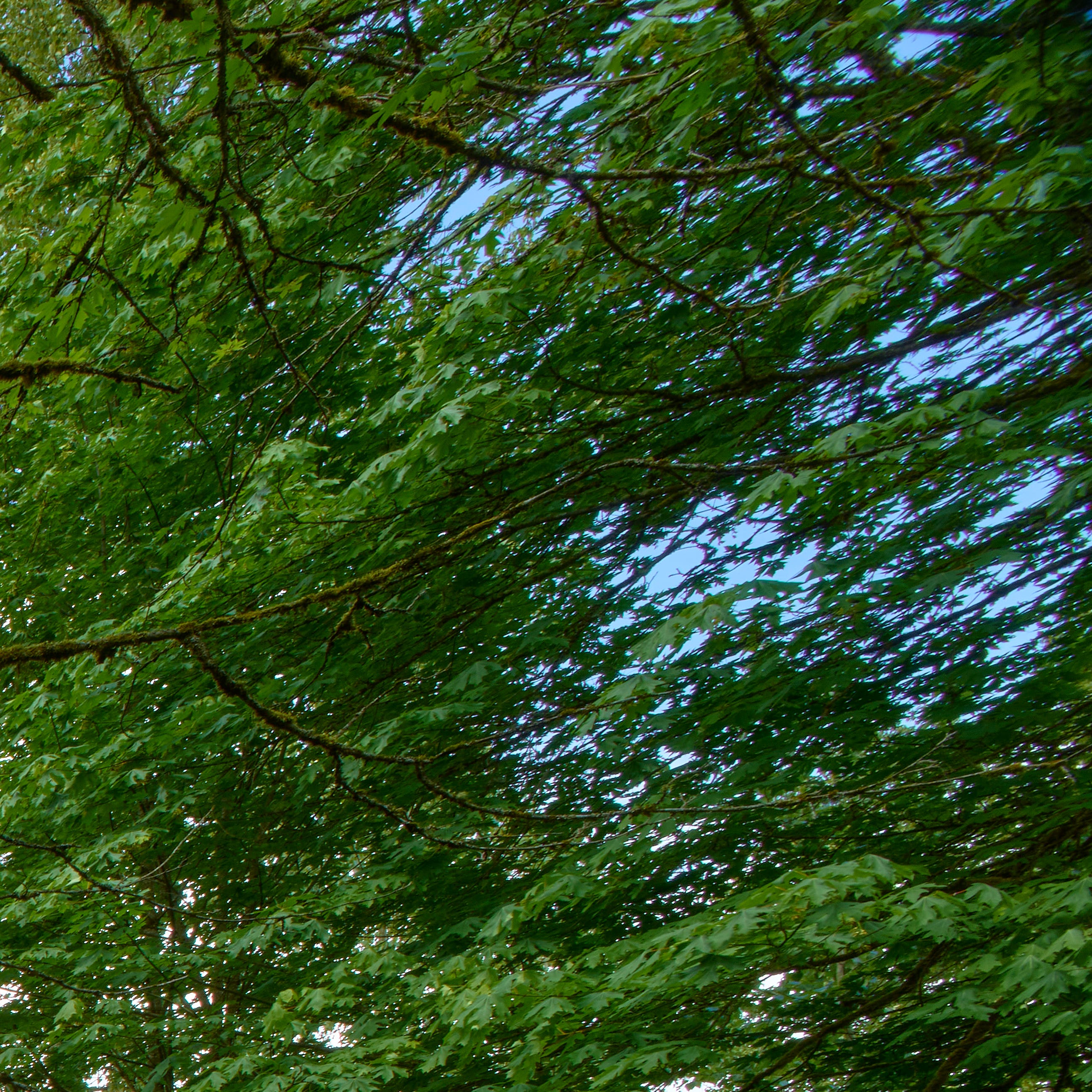
The elongation, on a line roughly from lower left to upper right, is immediately apparent.
I tried for a few hours yesterday to find a tool that would let me address this elongation, but no luck. There are in fact tools to deal with it, but the elongation is so severe than none of the tools worked well enough to be worth using.
I decided to make a 3-image panorama, to see if I could then trim off the bad edges/corners and get a nice result that was still ultra-wide. The amusing there was that Affinity Photo, where I built the panorama, did something I didn’t expect: it corrected the perspective distortion in order to combine the images accurately.
(I hadn’t thought about it, but how could you combine images that include severe stretching where they overlap?)
The only problem? By removing the stretching the images are contracted inward from the corners, as shown in the image at the top of this page. Compare the upper right corner of the panorama with the corner image immediately above. No comparison.
The alternative to just accepting the blank spaces was to crop the image to fit a rectangle, like this:
Not the same look! Still an interesting image, but I don’t like it as much as the other version. The swirly stuff is mostly gone, and the sense of scale is replaced by a mix of both intimate and distant perspective. Depending on your point of view, those could be good or bad; there is seldom only one right way to present a photograph.
Here’s yet another interpretation: a single photo from the set, cropped as square to get rid of the troublesome distortion by simply removing them. I then also cropped the bottom of the square off to get a better composition.
See more thoughts on this subject in the subsequent post here.