


Got My Goat
A high-contrast rendition of one of my neighbor's goats.

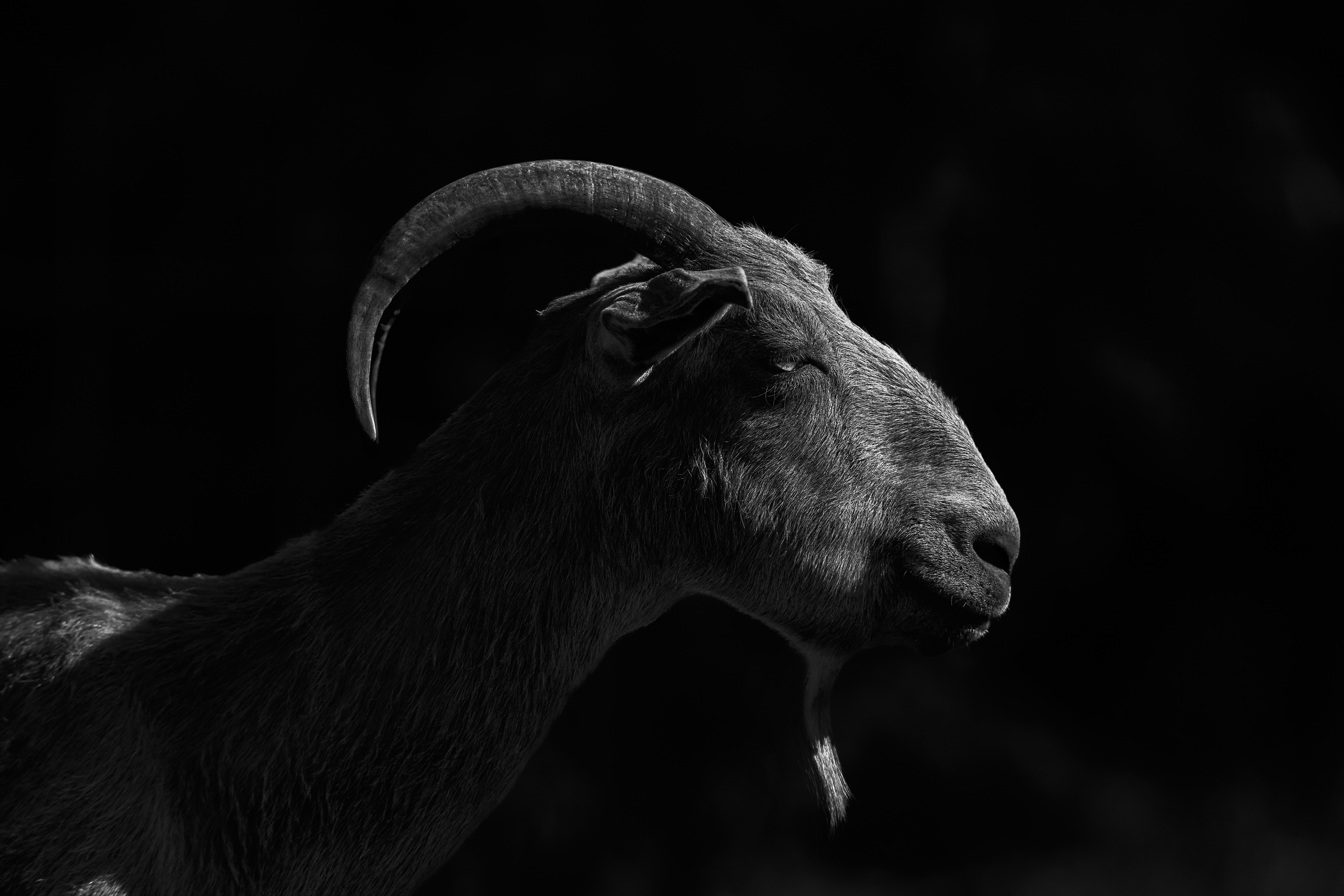
Even as I was taking this photo—late afternoon light, low northern sun—I thought that it would look good as a high-contrast image. I wasn’t really thinking black and white, but…this was my favorite rendition.
I played around with various ideas. Here was my first attempt at processing the image (the original was quite dark, underexposed, to make it easier to retain details in the brightest areas).
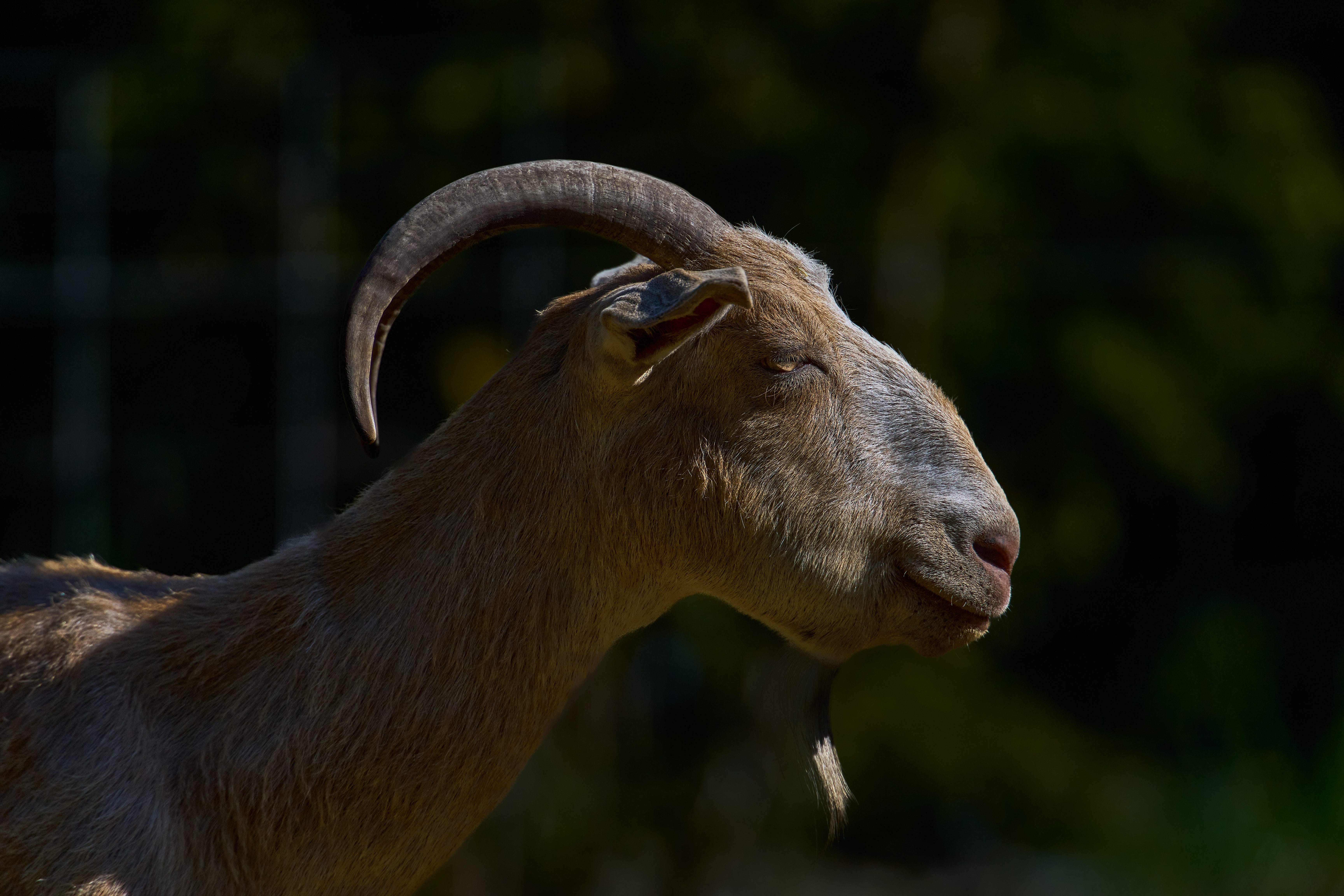
I retained all of the details in this version of the image, while keeping it fairly dark. But contrast, while a little strong, was still close to normal—just darker.
So I tried to really push the contrast and detail in the color image, and got to this:
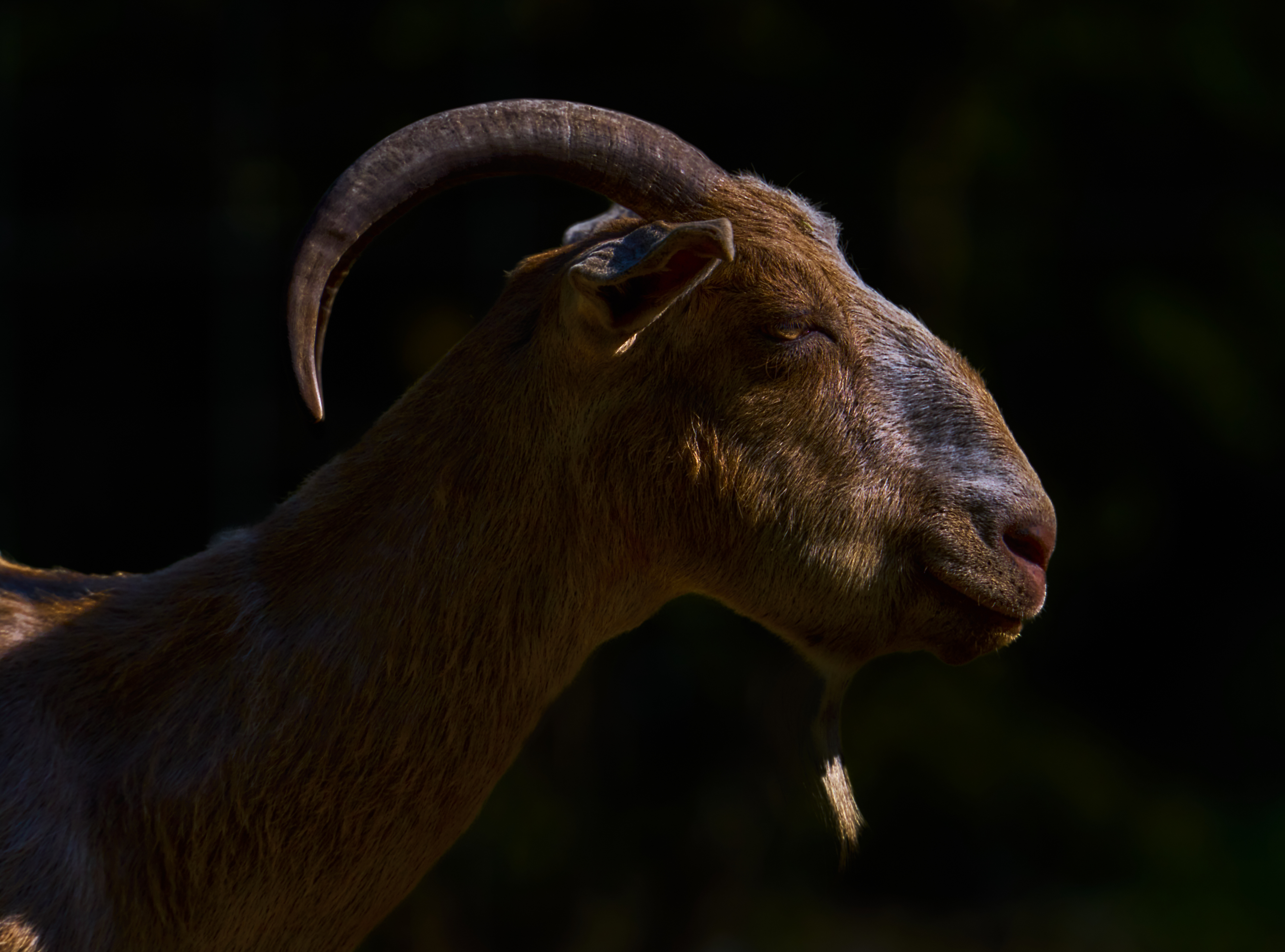
I was pretty happy with this one. Strong, dark colors, medium-bright highlights gave it a feeling of the strength of the animal. But then it hit me: what would this look like in black and white? And that’s when I spent about an hour on it, trying to get just the right balance of light and dark, detail and hidden, and trying to find a way to get the strongest possible texture. That’s the image at the top of this page.
All the same, I think in some ways the color image immediately above is quite strong, maybe the strongest rendition. But the black and white is my favorite because it is graphically strong: it feels more artful, less about the animal and more about how the light happens in a photograph. So I really have more than one favorite result, I guess. It was a fun couple of hours.
Shot with the Sony A1 camera, Sony 300mm f/2.8 lens with Sony 2x extender, so a 600mm lens. I also added a short spacer between camera and extender, which technically puts the lens in macro mode. However, this is a very gentle bit of macro magnification, probably equivalent to something like a 640mm lens—I did not do the math, but that is I hope a decent guess.
I went back and did another of the photos I took as a high-contrast black and white. I like this one, too.
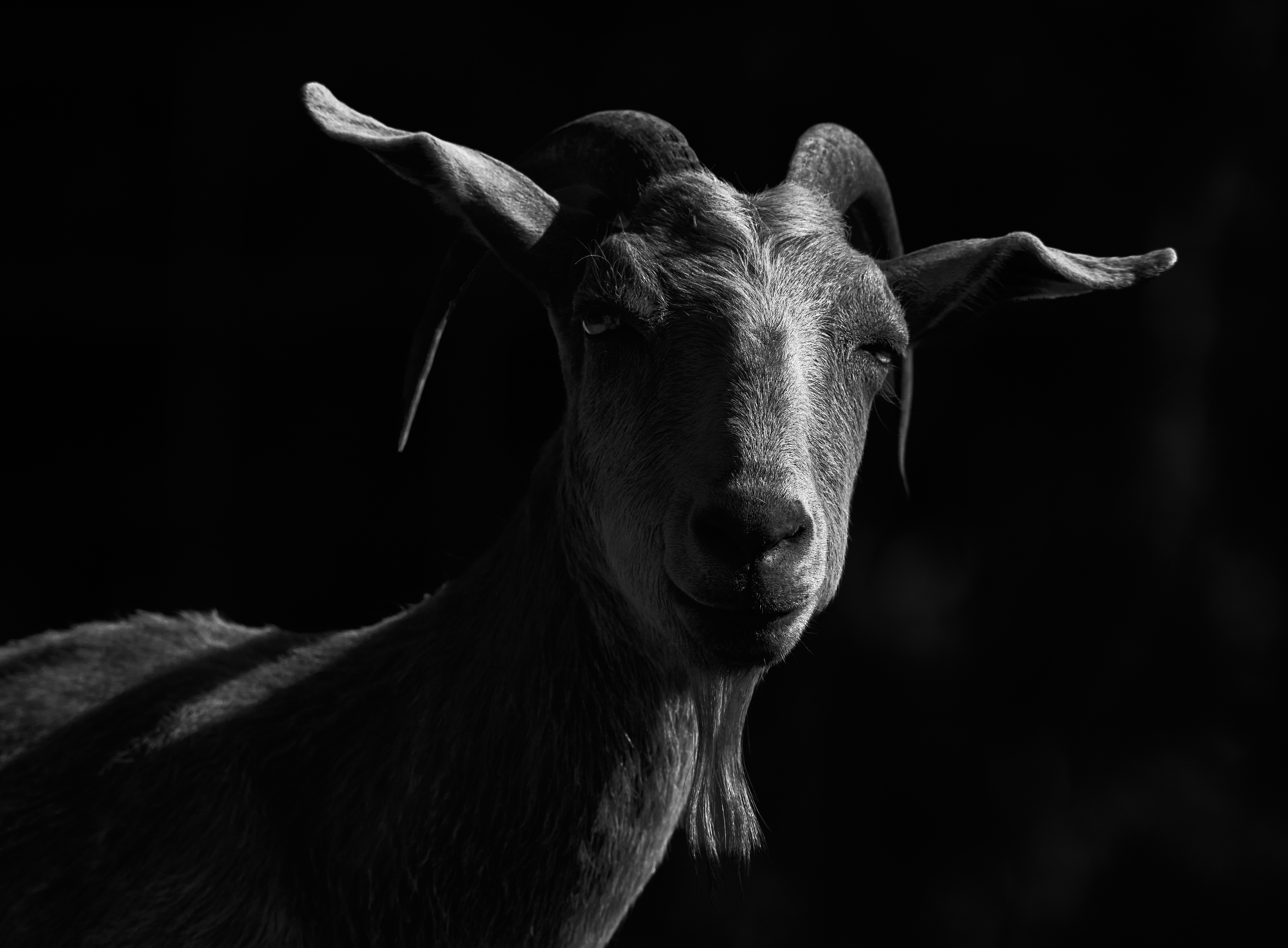
I like the top two pictures.