


How Much to Include in a Photo
A little or a lot, wide or narrow, you can edit the scene with your framing of a shot.


I didn’t spend a lot of time shooting images of the Point Wilson Lighthouse, mostly because it was cold and windy. But I did run around the site trying to find the ‘best’ framing. In the last post, I talked about how approaching your subject from a different direction can make a difference. Choosing what to include in the frame also makes a difference.
The shot above, also from 2018 (and also sloppy, all of the shots were not square to gravity!), includes two subjects: the lighthouse, and the residence. The framing is tight; there were other structures and I wanted to isolate just these two. This shot, with the tight frame and the carefully (corrected) straight lines struck me as the best of the shots. (The tight frame comes from using a long lens: the Sony 90mm f/2.8. Longer focal lengths compress the objects in the frame because the difference in size with distance changes; near objects and far objects look more similar in size than they would in normal eyeball perspective.)
But I also included more and less in some of the other shots. They don’t strike me as bad photos, but the one above looks composed, and has a certain gravity to it that I like. (We lived in Port Townsend for several years, and I have pretty strong feelings about the town and it’s historical artifacts.)
This photo, from the side of the residence, shows more of the actual current condition of the grounds and does not have the compressed look of the shot with the 90mm lens. This image was shot at a very wide focal length of 16mm.
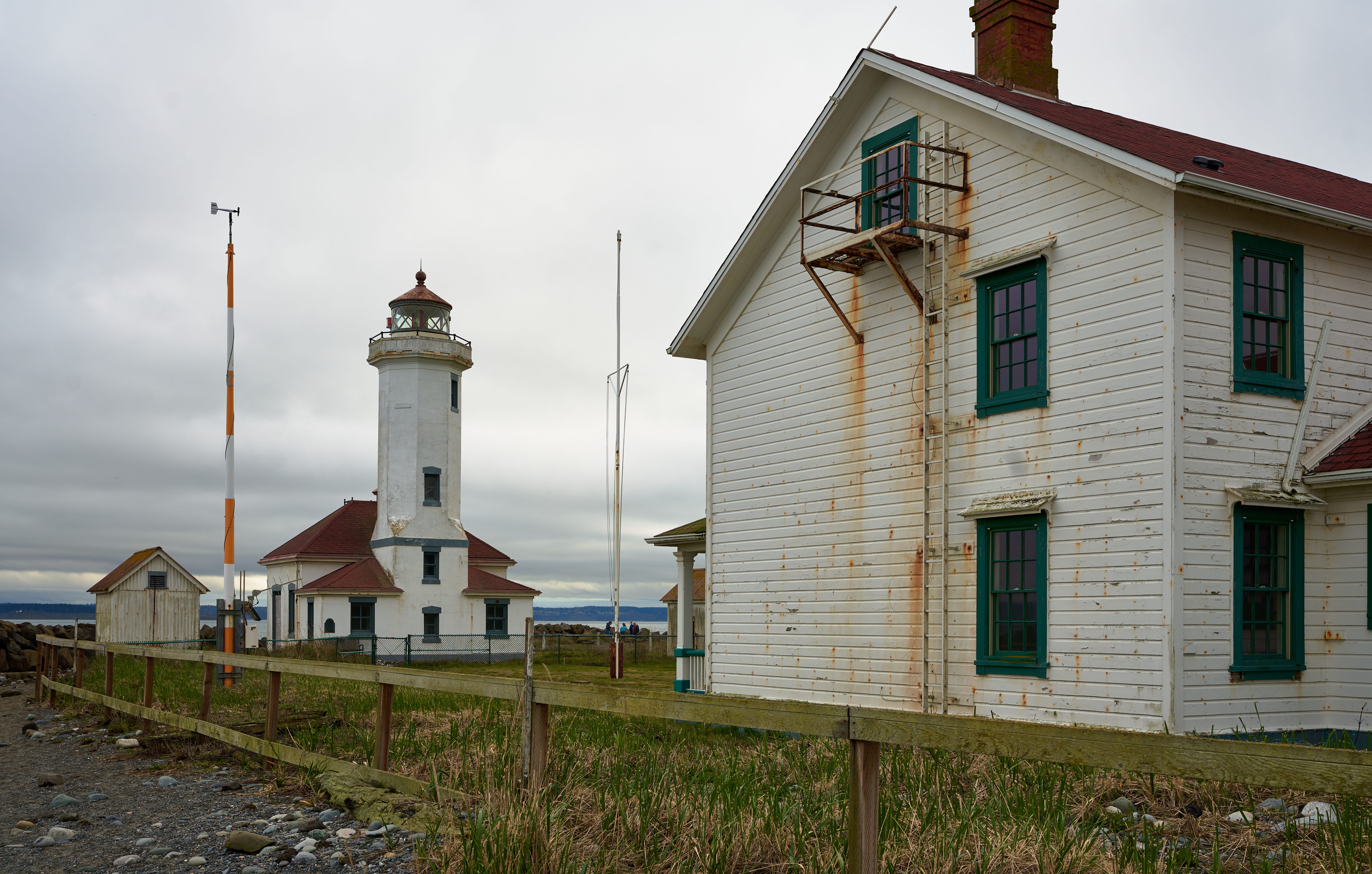
The residence looms large, and we see it’s dilapidated, weathered side. The lighthouse, however, shows its best face, so there is a nice tug of war here involving condition, size, perspective, and illumination.
And we get the little dilapidated shed for good measure in setting the mood. What happens if we take a few steps back—it only takes a few steps to make a big change with a lens as wide as 16mm.
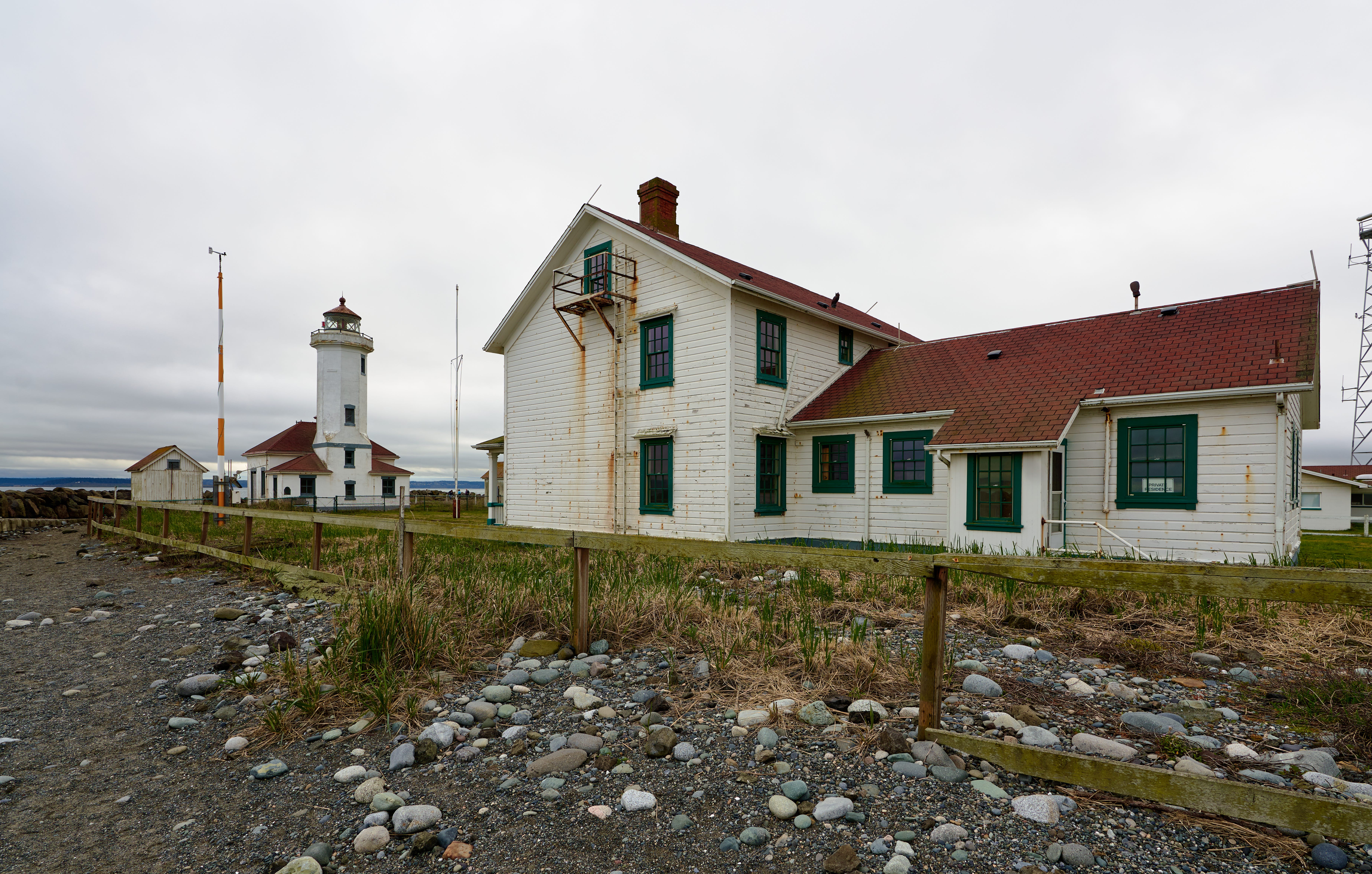
The building have shrunk in proportion to the frame; the details on the lighthouse are harder to see and we have the whole of the house and it’s complexity of shapes in the frame. It’s a very busy frame, not least because we’ve also added the texture of dirt and rocks in the foreground. It provides yet another ‘feel’ for the location.
However you change what is in the frame, and the proportions of those things, it’s always a good idea to change your perspective so you can evaluate different compositions. Even moving a few feet can make a big difference in what is in the photo, or not in the photo.