


Nothing to See Here...
Sometimes photographs of very ordinary objects can turn out to be very unordinary.

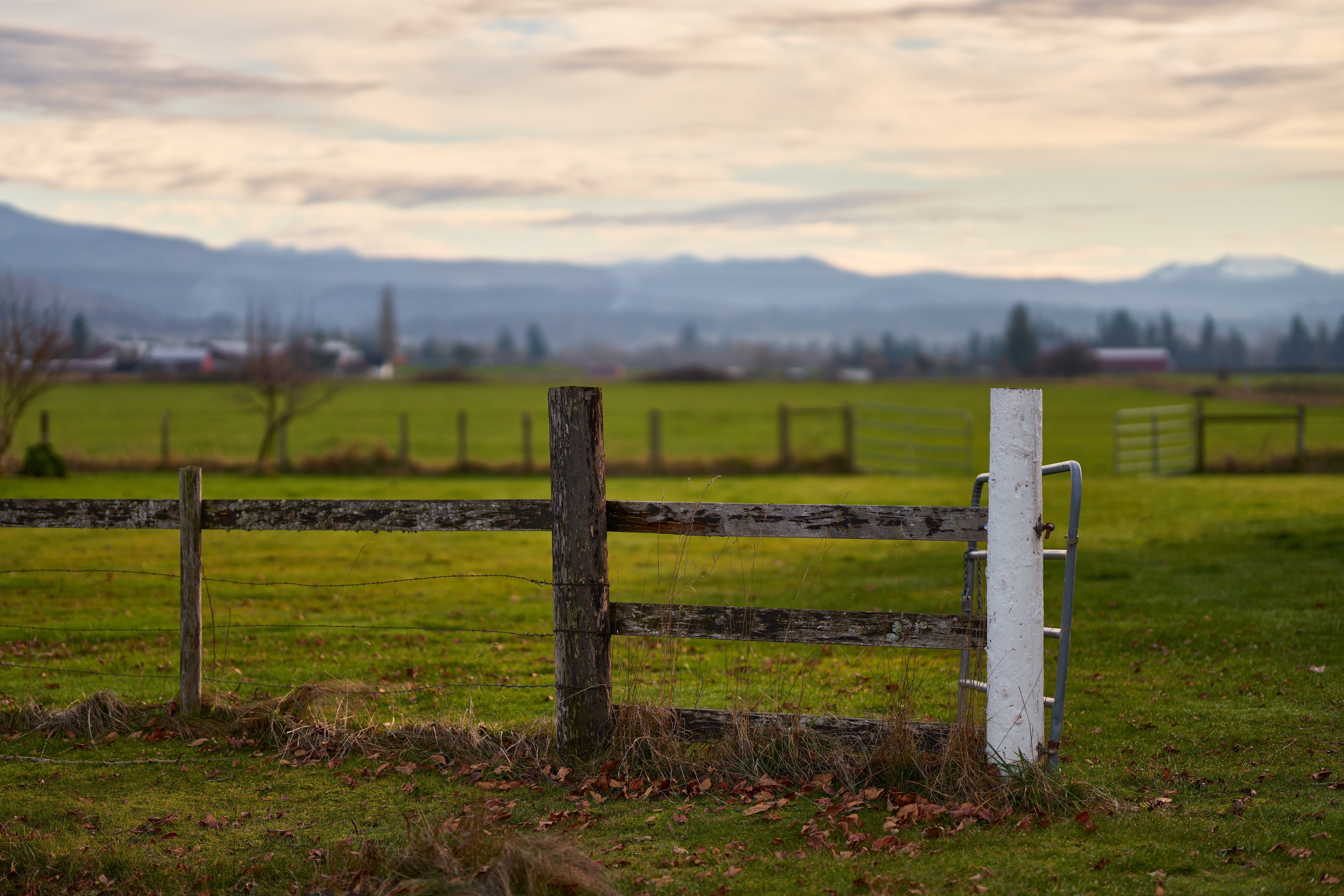
I am fascinated by fenceposts.
I took this particular shot, even though the rising mountain flank at left is Mt. Rainier. Fence posts just sit there, year in and year out, and they gradually acquire character.
Here we have three fenceposts, and they are nothing like each other. Skinny/fat, barbed wire vs boards, painted vs. natural. And a metal gate—the most ordinary and character-free fence item I have ever found.
And yet, the scene has a mood, a sense of privacy and history that I enjoy so much. I hope you enjoy it, too.
But that’s not the only reason I posted this photo. I almost always take more than one photo of a subject. I vary the depth of field, the exposure, what I choose to focus on, etc. When I sit down at the computer to process the images, I pause to look at the variations to see which one tells what story, and which one is the one I’m going to devote my time to processing. In this case, I actually spent a couple of hours with these photos. I had a goal in mind, and it was hard to get there.
First, the photo above isn’t a single photo; it’s a small-scale panorama. I had one photo that had very good detail at the base of the fence, but it has very little of the grass and leaf litter—it was cut off, because sometimes a photographer pays attention to one thing (focusing) when he really should be paying attention to something else (framing).
I had one photo, which makes up about 90% of the image above (the top 90%). And I had another photo that had more of the foreground in it, but was not as sharp (and included a bit of a house that sits to the left). So I combined them using panorama software, and got a little more foreground.
Then came the decision about to process the image. Should I make it bright? It was mid afternoon at a northern latitude, so although the sky was bright, it wasn’t BRIGHT. I found what I considered a happy level of brightness and I thought I was done:
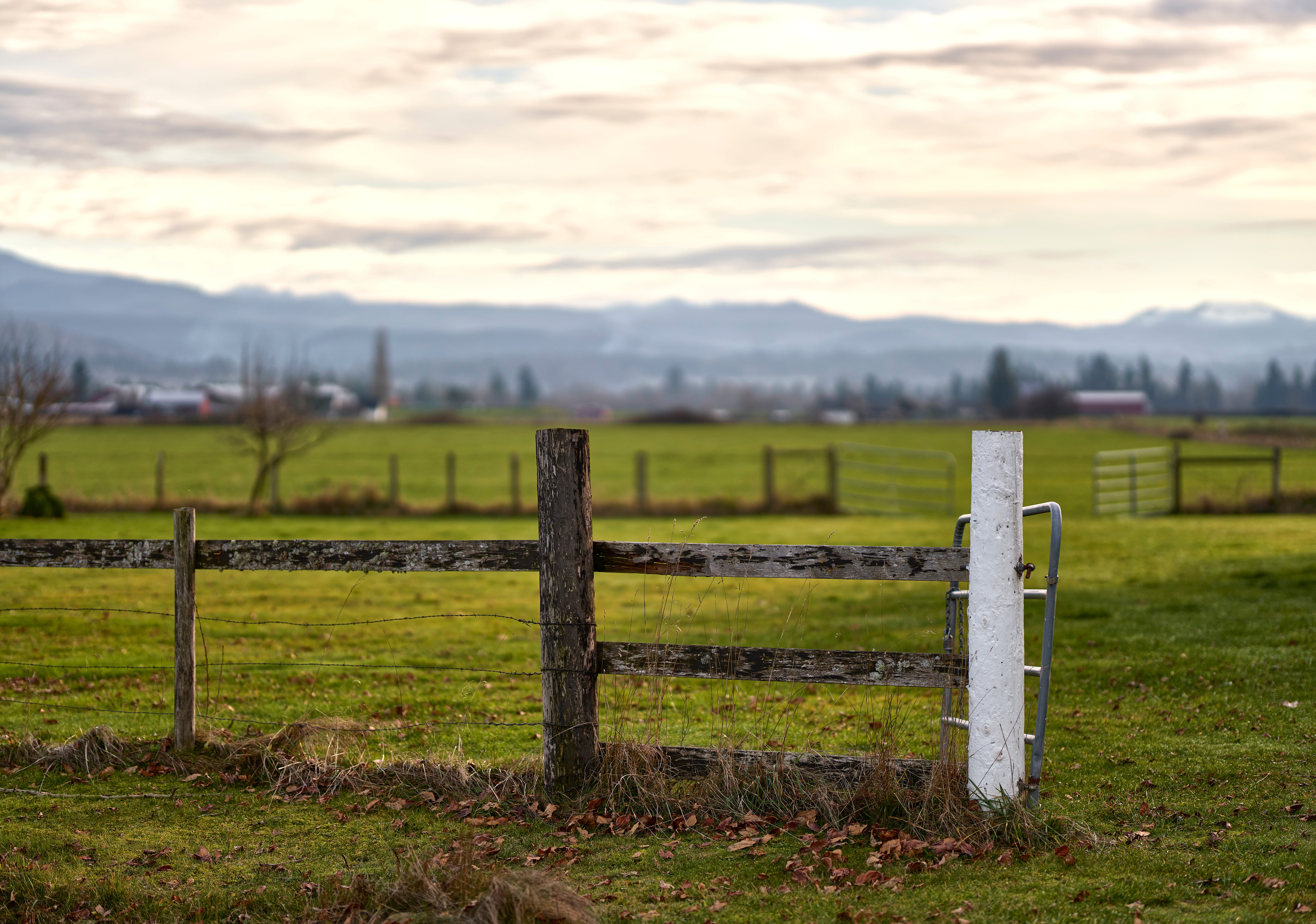
What I like about is that the dark fence stuff really stands out against the brighter background. But the longer I looked at it, the more I saw how washed out the sky was, and I wondered if I could do better. I wound up with the image at the top of the page. It has less contrast; it feels more somber, less exciting, but I like it better for my own tastes. And that was all I was doing: probing, assessing, looking at details, tones, what was in focus, not in focus, etc. Eventually, it led me to the image that I put at the top of the page. But this second image isn’t a bad image, and I like it, too.
Photography involves a lot of technology and technique, but in the end it is also personal and emotional. The differences from one version to another can even be very small, but I always want to find the version of the photograph that tells you what I feel about it.