


Two Old Cars
How I processed a photograph of a couple of old rust buckets.

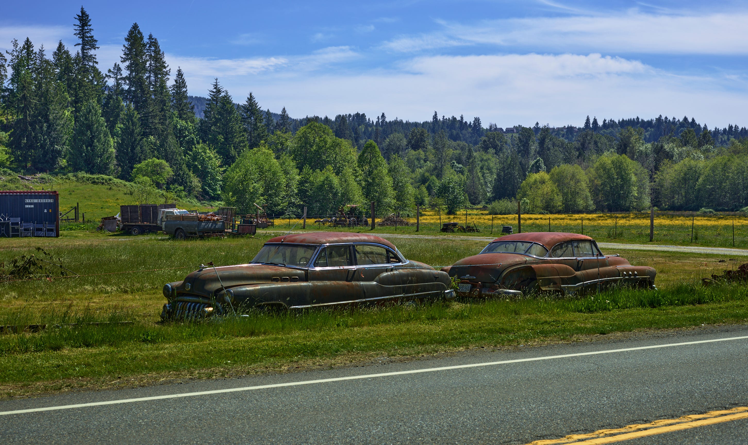
The photo above is highly processed; I had a feeling when I look at the original (see below) that I could really push hard on this photo to make it more vivid by making it look less natural.
Here is the raw look of the photo, as it was shot:
There were some deliberate normally-bad things I did in this shot. Yep: I shot it ‘wrong’ for specific reasons.
I underexposed the cars to get a reasonably correct exposure for the sky. The sky was a hot mess for taking a photograph: it was hazy, so there was not a lot of contrast between clouds and sky. It was very bright, partly from the haze reflecting sunlight and partly from the sun angle.
I included an overhead wire in the shot. Normally, I try to eliminate stuff like this when I am taking the shot. I try to find a view that is clean and photographic and shoot that. But I had take about a dozen shots before this one, looking for that One Shot to Rule Them All, and it just wasn’t there. Shooting like this from the left seemed to be the best angle, and the wire was just there, nothing I could do about it while in the field. (I could have cropped it out, but then I lose the tops of the trees, which I did not like the look of.)
The cars are dead center vertically. Since I knew I’d be cropping out some road, I kept the camera level to keep the scene in proper proportion. (Tilting the camera distorts the image - lines converge toward the top if I tilt it down, opposite for a tilt up.)
I really worked deep into this image. In fact, some of my later changes partially undid portions of my earlier changes. I had no idea where I was going; it was just a case of digging to find something worthwhile. I was kind of shocked when I looked at the image when I was done; the finished image looks quite unnatural, and I don’t usually do that. But I think that very unnaturalness is what makes the shot.
Here’s a list of what I did. The individual steps were not done in this exact order (I took my notes from the settings in Capture One; I did not record what I was doing while I was doing it, but it still gives you some idea of how much one can really dig into an image to ‘find’ what it really is. Where I remember what or why, I have included some notes in italics.
Edits on photo of two cars
Base layer:
Altered white point (more blue) The camera doesn’t always get the white point spot on, and sometimes it guesses really badly. In this case, it hid the blue that was in the scene so I brought it out.
1/6th stop added exposure The shot was underexposed, so I was going to need to brighten things. I only brightened the entire scene a little bit; other areas would have to be brightened selectively. I could tell from the start that the sky was already almost too bright; the trees were way too dark, and that the darkness around the cars was kind of interesting and I should try to hang on to that.
Small increase in contrast This was not easy to discover; the scene already has excellent contrast. But I turned out that altering contrast was useful. I recently discovered that you can emphasize part of a photo by increasing the contrast for that area, and decreasing it elsewhere. This does not have to be dramatic to be effective. But it’s a useful tool for focusing attention.
Minimal brightening of shadow detail The real issue in all areas of the image but the sky was the ‘blacks’, which are the darkest areas of a shot. Typically, in a dark photo like this, the blacks will be literally black. No details. So knowing I would be doing a heavy increase in brightness in the really dark areas, I did only limited brightening in the shadows. (Plus, brightening the shadows actually also brightens other tones, from just-brighter-than-black to minor shadows. I have to be really careful with the shadows because of these spillovers.) I mostly adjust blacks before I adjust shadows, for example.
Major brightening of blacks Bringing up the blacks is often one of the first things I do when editing any photo. My personal preference is to brighten the blacks just enough to reveal the darkest details—even if those details will not show up later in a JPG (with its limited tonal range due to compression). They would be useful in a high-quality print. This is a bit of a dance, however; I may have to tweak the blacks later depending on what happens in the shadows, highlights, and whites.
No sharpening I will typically apply Clarity (micro adjustments to local contrast that is a subtle change compared to true sharpening) or Structure (real sharpening) to most photos and/or layers. It’s effective in creating a 3D look that I strive for—but in this photo, sharpening was limited, as I wanted more of a flat look, with just broad-scale contrast adjustments to create a focus. Kind of a technical point, and hard to describe if you haven’t found yourself deep into editing a photograph that doesn’t seem to have a subject that stands out.
Adjustments to tone curve This is a tricky area that takes time to learn how to do right. By ‘right’ I mean without destroying the photo. For example, if I am adjusting a medium gray tone because it brings out the details on the car, then I have to also check to see where else that same gray tone occurs—I might be destroying subtle detail in the grass at the same time. A little of this usually goes a long way, although sometimes one can use Curves instead of white/highlight/shadow/black adjustments. It’s a very ballsy move to do that, though; it’s like the difference between going by the book, or learning jazz drumming on your own. (It’s not THAT bad. but you have to have the ability to simultaneously focus on one part of the picture to get the adjustment just right, while also maintaining a global perspective. Hence jazz drumming: it’s like improvising on the snare while keeping the bass rock steady. Or jazz steady.)
Small increase in red saturation; red lightened This was something I knew I wanted to do from the first touch on the image. I generally like to warm up my shots (or portions of them) with increases in saturation of red/orange/yellow (and sometimes green as well). When you have foliage in your shot, most of the time the vegetation is a complex arrangement of yellows and greens - the yellows are much more dominant that you would expect from how it looks. A little change in yellow can be dramatic, giving shape to vegetation in almost magical ways. But you have to tightly control the relationships: both saturation and brightness have to be just right. Practice makes perfect—but every image is difference, and playing with the white balance takes this tweak into Olympic Competition territory.
Orange same as red See above.
Yellow: small reduction in saturation, small increase in lightness To bring out the structure in the trees (before this change, it was just a wash of leaf shapes; adjusting yellow gave the trees individuality).
Cropped It had to happen; too much road.
Lower half of image (adjustment layer):
Increased contrast
Altered white point (more yellow, more green)
Reduced exposure by 1/6th stop
Healing layer: remove overhead wire
Sky portion of image: (adjustment layer)
Increased contrast The sky was a mess, as noted earlier; not much brightness difference between sky in clouds, and there was also a difference in brightness and contrast from left to right. Increasing contrast made the sky bluer, but it destroyed detail in the clouds. Thus, I did a…
Big reduction of brightness in brightest portion of clouds (they were blown out by contrast increase)
Upper half of image (adjustment layer)
Reduce contrast This brought back a little more detail in the clouds; this is the subtle grays in the lower portion of the clouds just above the trees.
Small reduction in overall brightness The cars were already just right, but out of balance with the rest of the image, so I tweaked brightness just a bit.
Increase brightness of shadow areas As often happens, the above step muddied the trees, and a little tweak to shadow levels dealt with it without adding further confusion to the sky.
Increase brightness of blacks I had a little room to play with in the 256 levels of brightness available in the (eventual) JPG image, so I brought out some of the dimmest details under the trees a bit more.
All of that was not the only way to get an image of the cars; I did try my best using ‘normal’ process on some of the shots. Here is probably the best attempt at normal processing, looking from the other end of the line-up:
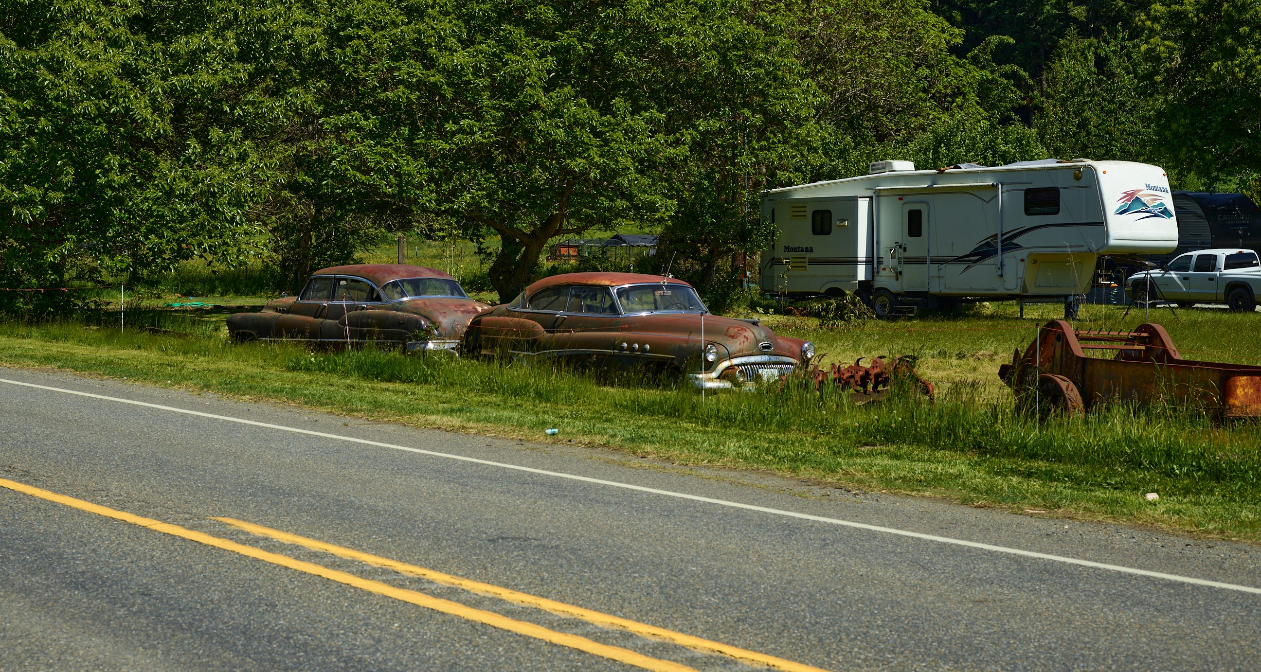
I’m not thrilled with the trailer, but otherwise it’s a good composition. If the trailer had been rusty, too, I might have just stopped here. But something was nagging at me, and I knew I had the images looking in the other direction yet to process. My memory of the shoot was that those last shots had ‘something’ indefinable, and I was eager to push on and see what I can find. Glad I did; the above is a ‘good photo’ by my standards, but the one at the top of the page will likely get printed and find a place in a frame at our home.